![AAAAAND ANOTHER THING: [CENSORED] [REDACTED] [BABY SCREAMING] [SIRENS] [SILENCE].](https://thehowleronline.org/wp-content/uploads/2025/06/lucy-1200x800.jpg)


Rating political signs
November 8, 2022
Disclaimer: The tier list is not representative of The Howler’s opinion on the views held by these candidates.
Despite having no experience in visual media and art evaluation, graphic design is our passion. I, Karen Wang, consulted Annabel Tiong who is a connoisseur in the artistic elements of Timby webcomics and Rita Lai for her skills in blending shades of budget hair dye to prove our inner mettle though highly professional critiques on the highest art form one hopes to master in political expression: lawn signs on Wolf Trail.
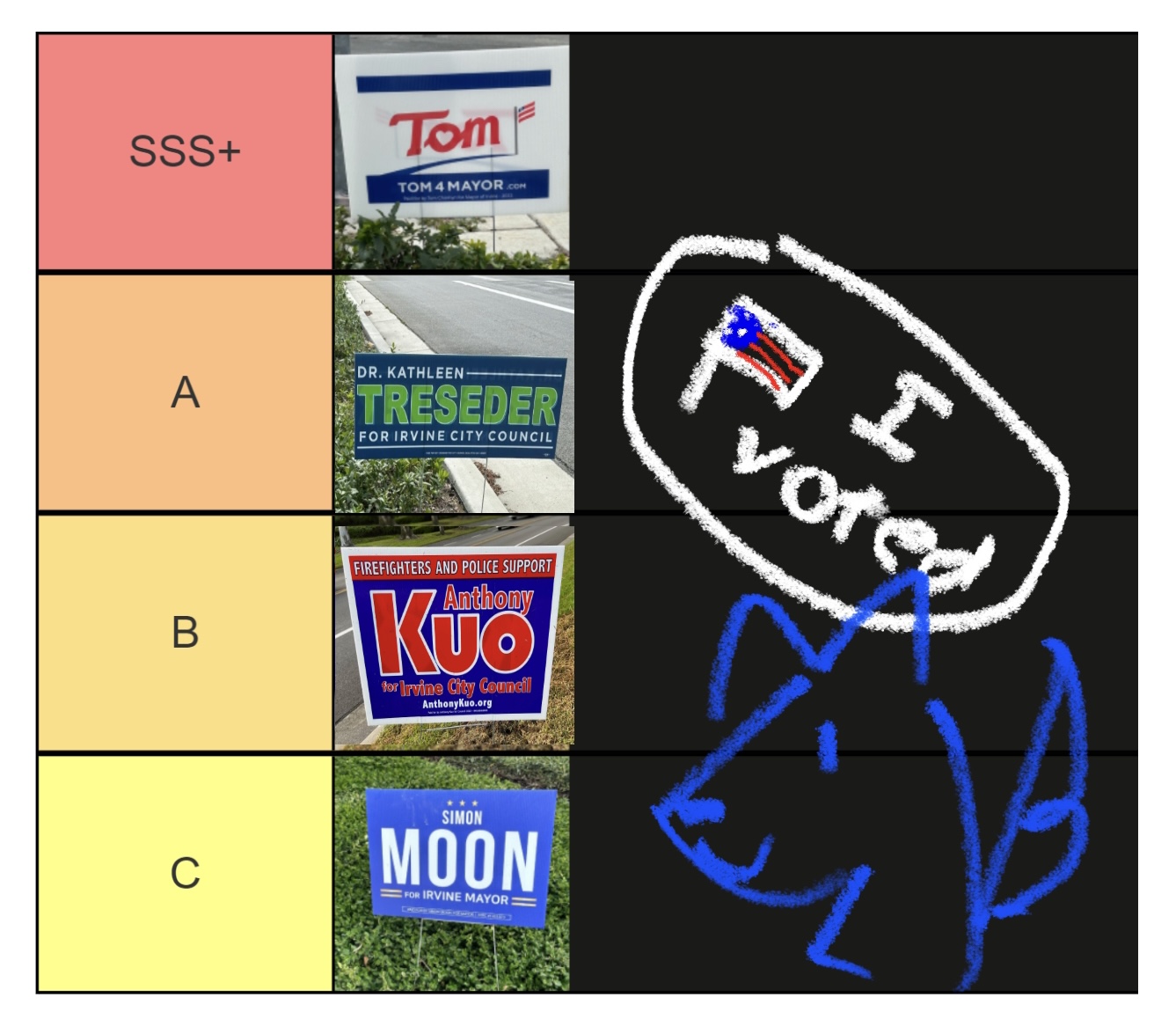
SSS+
Tom’s appropriation of our glorious American flag is instantly forgiven upon observing his use of pathos in the “O” of his name, with his 2D heart piercing the heart of his fellow American voters. The absence of his last name lends him a colloquial tone and adds to the dramatic sass of his lawn sign. The usage of “4” instead of “for” in his website address conveys his valiant attempts to blend into GenZ culture, which we applaud.
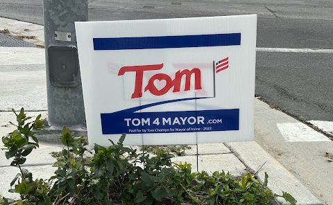
A
“Treseder” also harkens back to the roots of her campaign: environmental justice with the slight acknowledgement to trees along with the verdant choice of color. The smaller dimensions of the sign also point to her role in saving the trees through conserving the use of cardboard compared to the larger lawn signs of other candidates. We congratulate Treseder on her role in preserving Irvine’s beautiful trees and her continued dedication to her green platform in all aspects of her campaign.
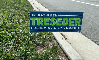
B
“Anthony Kuo for Irvine City Council” is one of many commonplace illustrations of the 21st century. The sign cleverly uses white borderlines, by enhancing the size of the ‘K,’ ‘U’ and ‘O’ to call attention to the human failing of susceptibility to bold colors, for although one may feel overwhelmed by the initial glaring letters, the sign was actually meant to reflect a nuanced personality by the campaigner. The contrasting color scheme creates an air of definite mystery, and subtly draws viewers into the enigmatic meaning of “firefighters and police support”—with the repetition of soft consonants ‘f’ and ‘s’ acting as juxtaposition to the glaring call to action as you voice KUO!!!!!! in your head. But overall, it’s kind of mid.
C
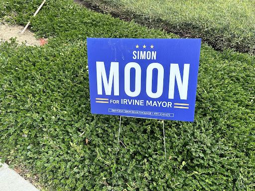
Since there is already a self-grade of three stars, we shall follow in precedent and award this sign the mediocre rank of C. The large font of “moon” provides evocative imagery of our world’s celestial beauty, and perhaps voters may be overwhelmed by emotion by envisioning the success of the first moon landing. We do appreciate his use of alliteration in “moon” and “mayor” with the repetitive consonant sound creating a harmonious tone, however, we cannot deem this lawn sign gloriously golden since the color accents are far too muted.
![AAAAAND ANOTHER THING: [CENSORED] [REDACTED] [BABY SCREAMING] [SIRENS] [SILENCE].](https://thehowleronline.org/wp-content/uploads/2025/06/lucy-300x200.jpg)