Ranking Howler pages: Last to first
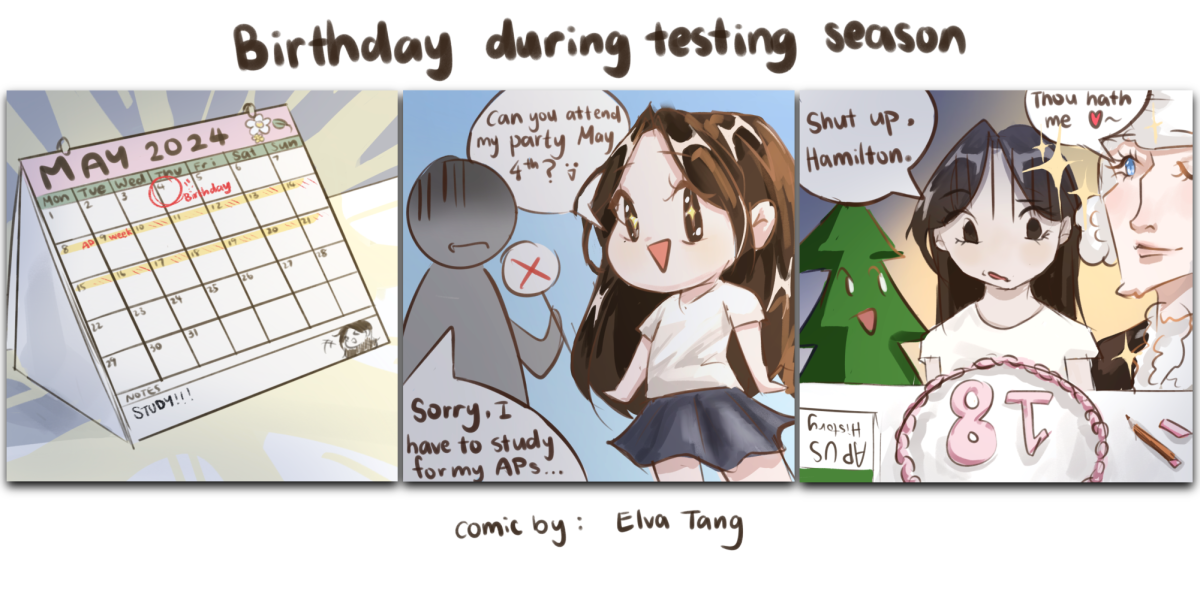
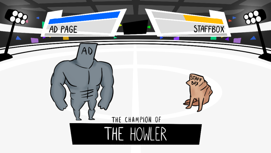
THE FIGHT BEGINS: Favorite-to-win Ad Page gains the lead over underdog Staffbox. Who will win?
January 24, 2022
Within the Howler, there has been a never ending debate over which page in our paper is the best, but it is time to end that debate once and for all. Find out which is the worst and which is the best in the following dissertation.
News, A&E, Centerspread, Viewpoint, Junk
Even though none of the pages on The Howler are bad per se, they have an overwhelming mountain of text and graphics that are honestly lacking that je ne sais quois. I always find that these pages are the last to catch my eye, and I hope that in the future, I can see some different shapes on these pages, such as circles, dodecahedrons, quadcles or a singular dot.
Sports (due to Staffbox)
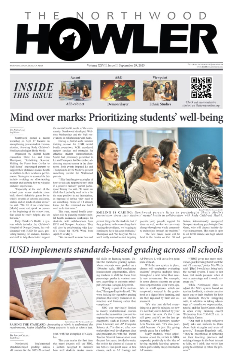
Sports is only saved by the superior Staffbox. Every issue, the Staffbox, listing all of the members of staff on the Howler, such as staff writers and staff photographers and staff graphic designers, always stands out to me as original, and the way its design, including different shades of gray for the background, is always changing has me excited to see the next issue’s version.
Ad
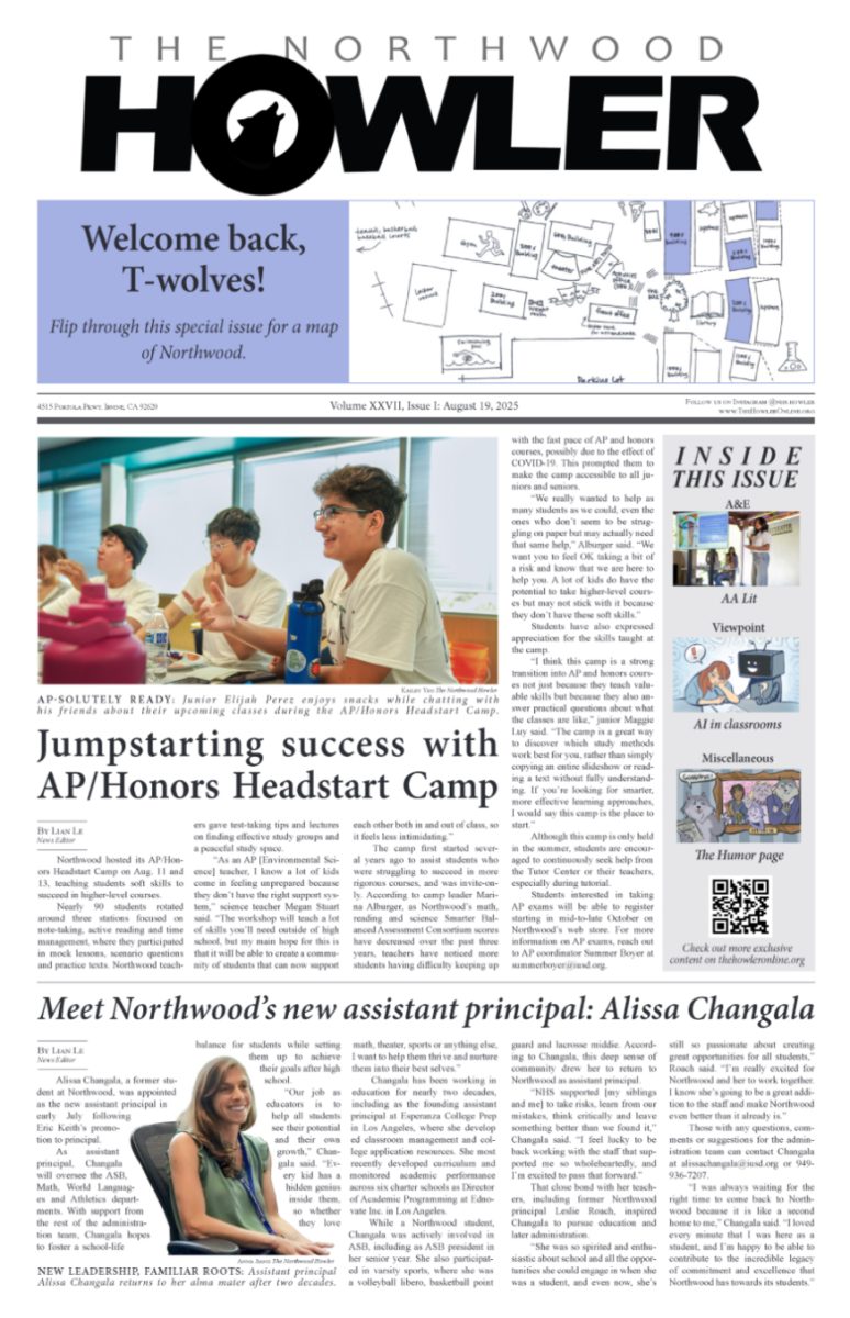
The ad pages are so engaging and riveting that I cannot take my eyes off of them. Not only do these wonderful places give us the money to be able to afford publishing our paper, get us out of our crippling debt of $6,000 (actually not an exaggerated number), and give us the financial power to conquer anything in the material world, their designs are insanely detailed and captivating. The various deep literary details in each letter of the poster that surpass the literary prowess of Northwood’s reading curriculum have me in awe. Information about what I could learn in Varsity Driving Lessons and at Elite Tutoring Prep compels me to pick up my phone and enroll in classes immediately. They are not a want, but a must. The power of these pages is undeniable, and they rightfully take the 2nd place spot of the pages on the Howler.
Accent
From a completely unbiased perspective, with no personal connections, and without the slightest hint of favoritism, I would have to say that the Accent page is by far the best page in the Howler. I don’t think I need to explain myself for this, as everyone knows that this page is superior, but in case you weren’t aware, the Accent pages’ stories, graphics, titles, captions, and layouts are unparalleled. It has that je ne sais quois, and it is just the best. Nothing else has to be said.


